Speed Up Cashier Operations Through Interaction Design
Summary
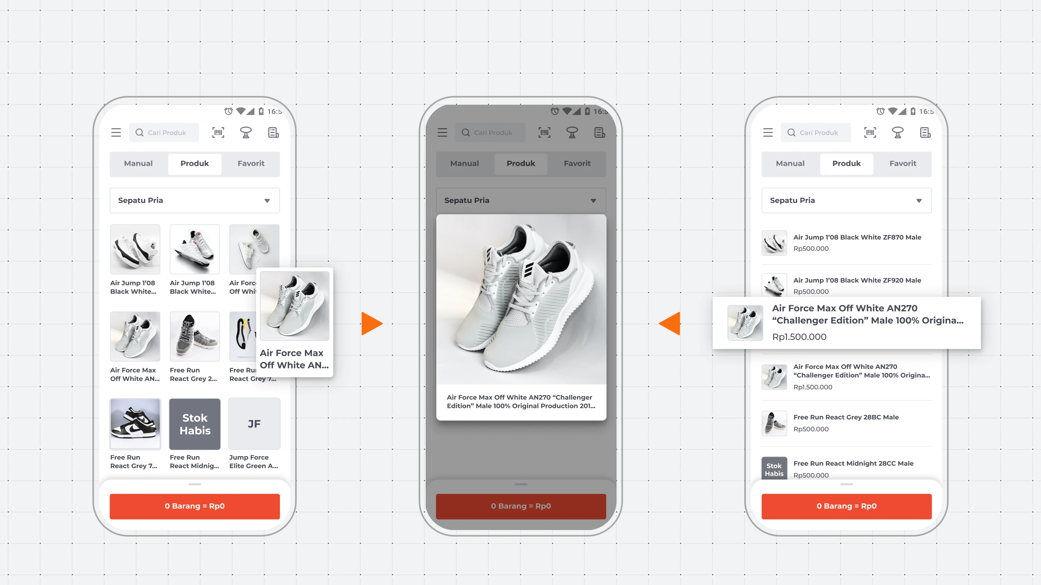
Retail drugstore merchants using Qasir's POS app could not validate products by image during transactions. Both available layouts (grid and list) forced a trade-off between image size and product information. I designed a long-press pop-up that displays an enlarged product image without leaving the transaction page. Layout-switching dropped 70% for one flow and 35% for the other within the first week.
Background

Qasir is a POS app serving MSMEs in Indonesia. Its business model charges only for features merchants need, keeping the base product free. Retail and drugstore merchants make up a significant portion of the user base, and their transaction pages carry the highest density and risk of any screen in the product.
Goal
Give merchants quick clarity on product type in the transaction recording process.
Process
The Struggle
Cashier can’t validate items from image with our current layout. Our retail drugstore MSME Cashiers has difficulties validating items by its name in our POS Mobile App. So they look for layout with bigger picture. But they change the layout in the middle of transaction. They need at least 15 seconds more in transaction just to change layout. If they serve 100 customer in a day. They’d waste extra 25 minutes.
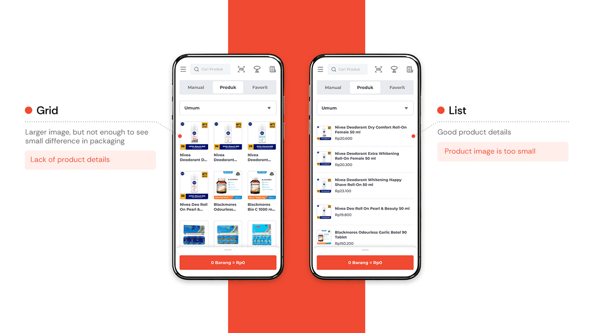
Through interviews and seeing how their product image actually shows in the app, it's clear how hard it is to differentiate similar product variant with only product name, or only image.
A familiar solution
Because some products has lots of variant and the easiest way to know is to look at its packaging. So, I made viewing large image easier with one of the most familiar way we know now. Long press.
The design
I chose a frameless pop-up at the largest available size over framed card. Because, a large portion of Qasir's merchant base uses smaller-screen Android devices, and a framed card reduced the usable image area. The frameless version also created clearer visual hierarchy: the pop-up content did not compete with transaction page elements underneath the overlay.
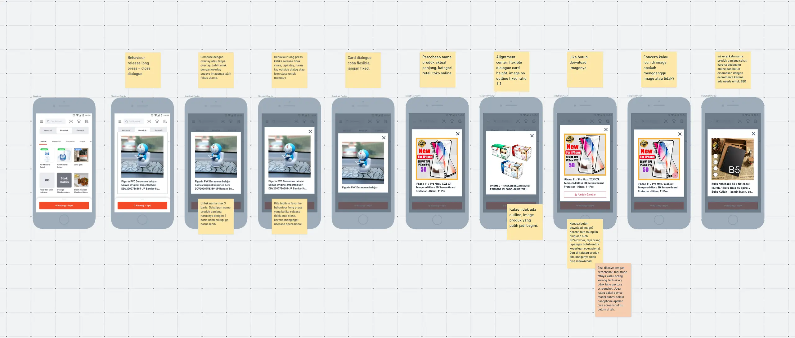
The pop-up shows the product name (up to 3 lines with ellipsis) but excludes price. Because, the use case is "system vs actual" validation. Packaging size, color, model is way more important. Price is already visible on the transaction page and is not part of the visual matching task.
I used Android's default 500ms long-press duration instead of a custom threshold. Because, the engineering team could not customize the interaction timing within the sprint window. The default felt slightly faster than the intended design, but it fulfilled the need without introducing usability issues. Me and the product manager shipped it.
The Result
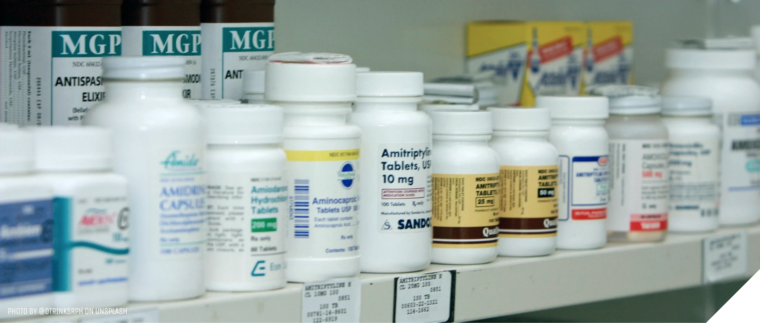
After 2 weeks, me and the product manager analyze their feedback. Drugstores not only need to look at package image but also shelf code. Sometimes, they still need to look at whole product name and price. We take these feedbacks into consideration and learning for our future improvements.