Summary
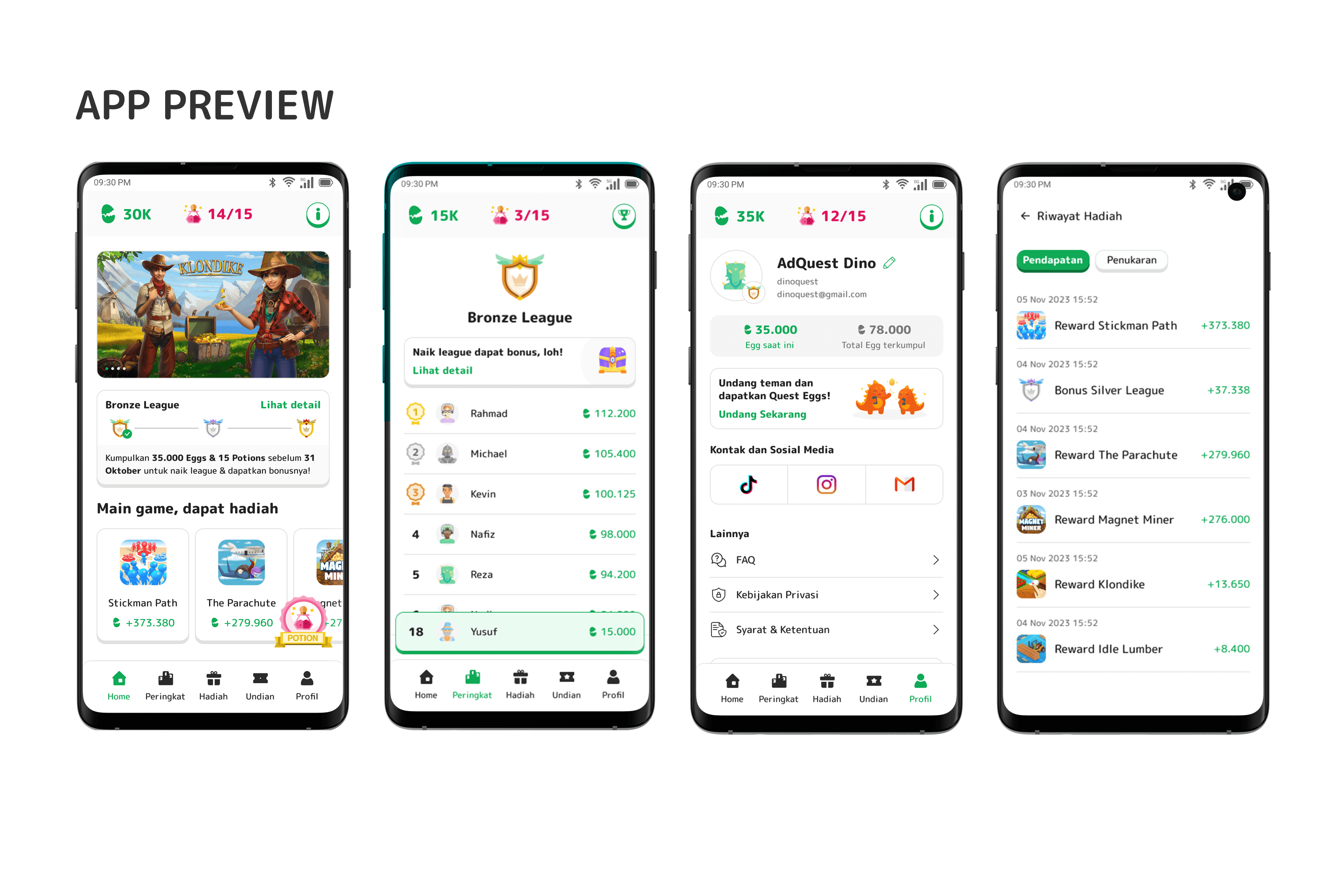
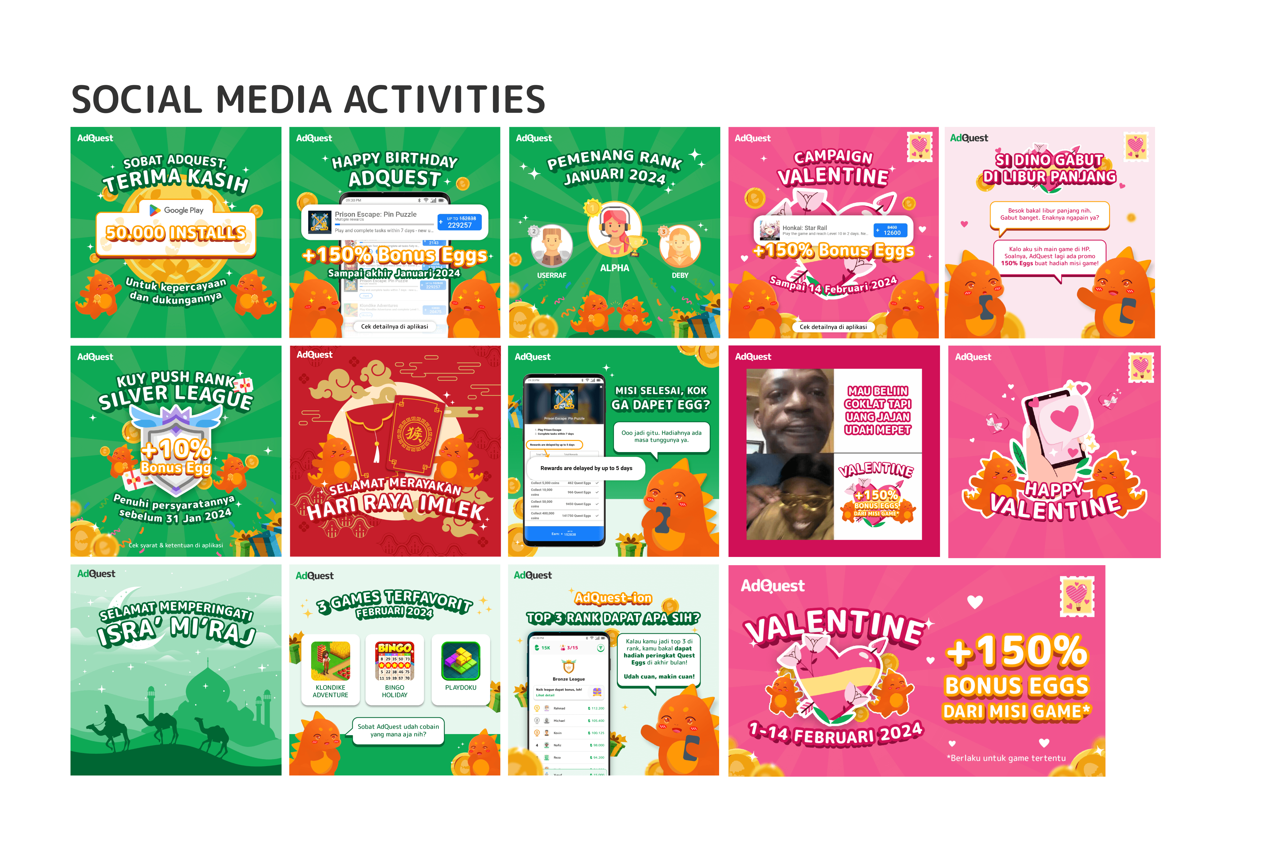
To gain strong differentiation from other money making app, AdQuest chose to have overall bright and vibrant tone that communicate casual fun more than dark tone which was commonly used for hardcore gaming audience. I use the brand's mascot and game elements in both the app's UI & social media posts to communicate better with the intended audience. Resulting in strong distinction and enabling the brand to reach untapped audience, especially those who may not identify as hardcore gamers.
Background
AdQuest is a product that gives reward to their audience after they finish quests or mission within the app. For example, in 30 days, players must finish level 100 in a certain puzzle games. Or, player must install some app from google playstore.
When finished, they received their reward called Quest Eggs. That reward can be redeemed or exchanged to eWallet balance and other gifts. The missions are framed like a quest in RPG games, and the mission itself is an advertisement offered by other developers, hence the product name is AdQuest.
Goal
Designing the brand's logo and its treatment in app's UI/UX & social media.
Process
Target Audience

Highschoolers or early college students
Looking for fun ways to make money, separated from professional work
Interested in hypercasual mobile games
Logo Concept
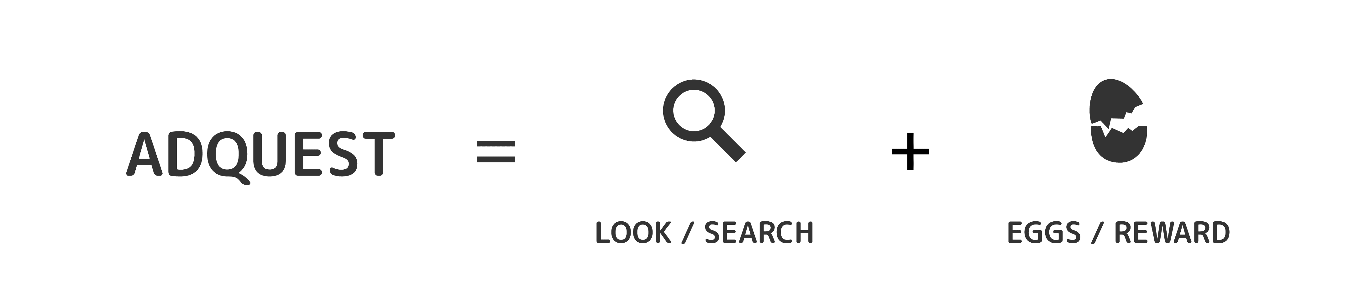
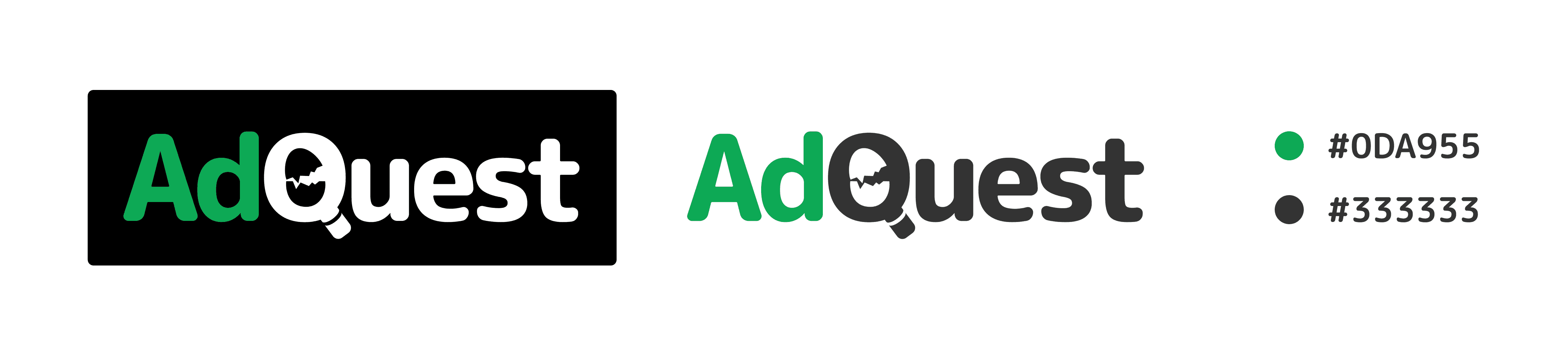
I want to make sure our logo captures what our players are doing and their goal in the app. They are looking for missions to earn Quest Eggs. Therefore, I combine magnifying glass and an egg to symbolize “searching” and “reward”.
Design Implementation
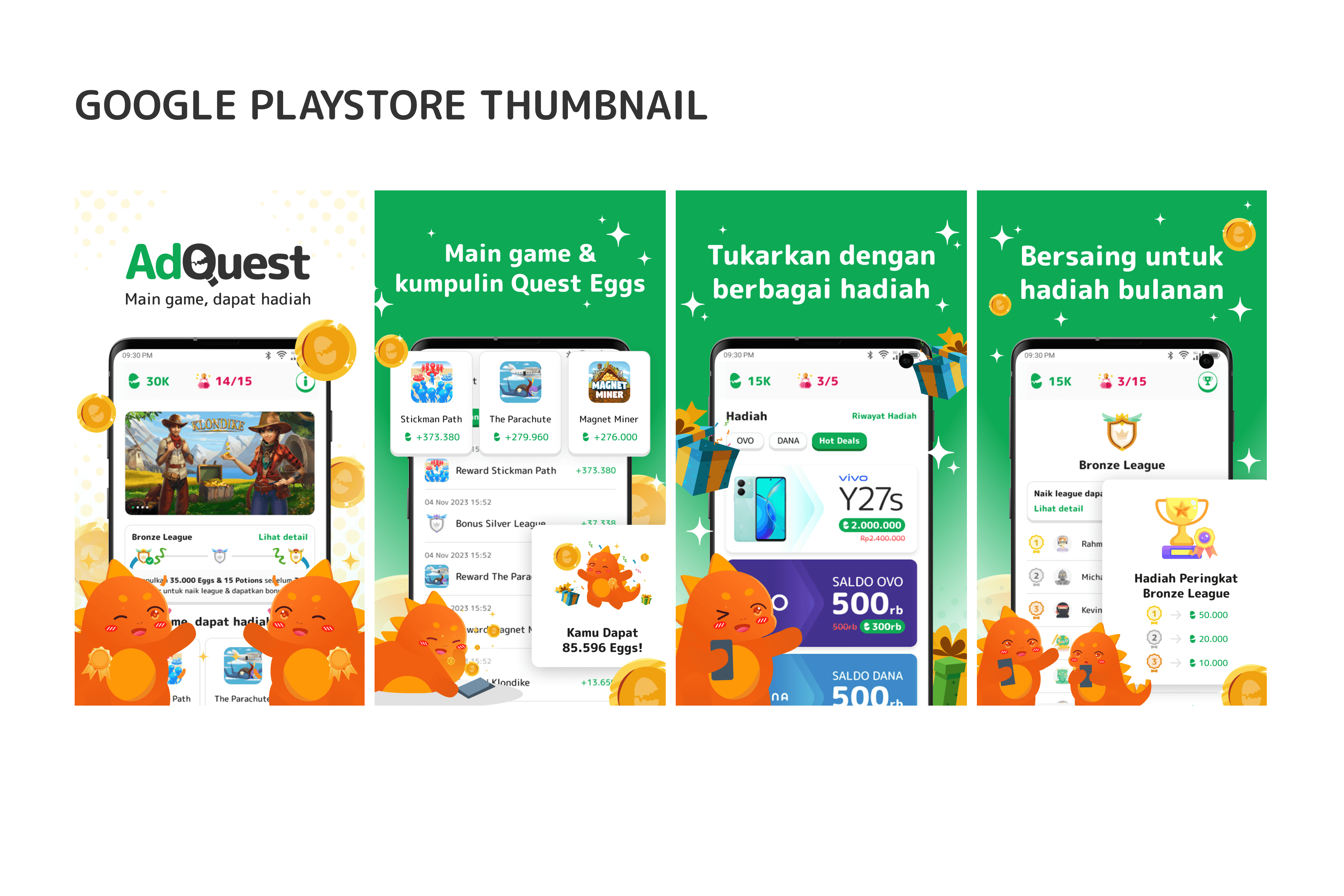
Here are the implementation of the design concept. The thumbnail, the social media posts and the whole app design. The copywriting is direct and easy to read because this product is about having fun while making money.